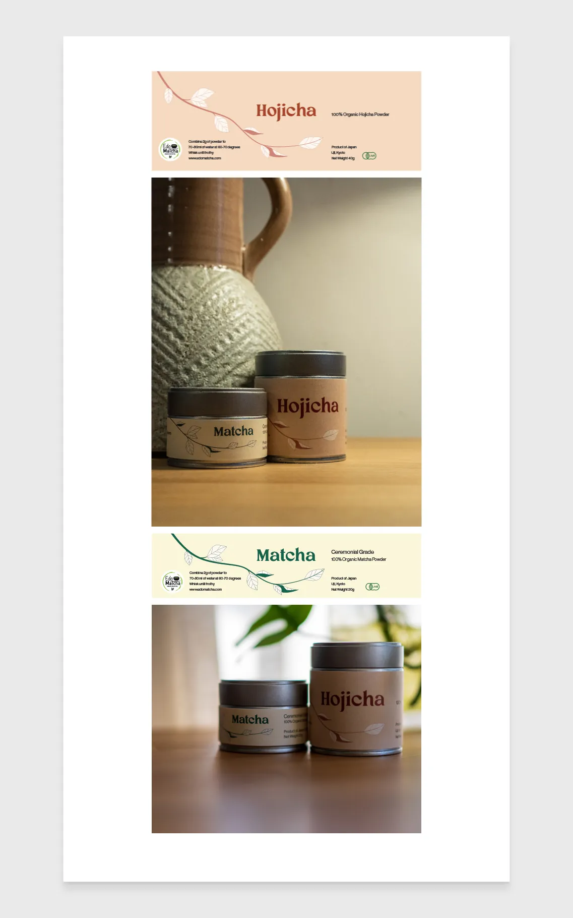
Not long ago I was approached by my good friends who happen to also run a successful Japanese tea import business called Edo Matcha. They were expanding their line of Matcha powders, which meant introducing a new label type that they had no designs for.
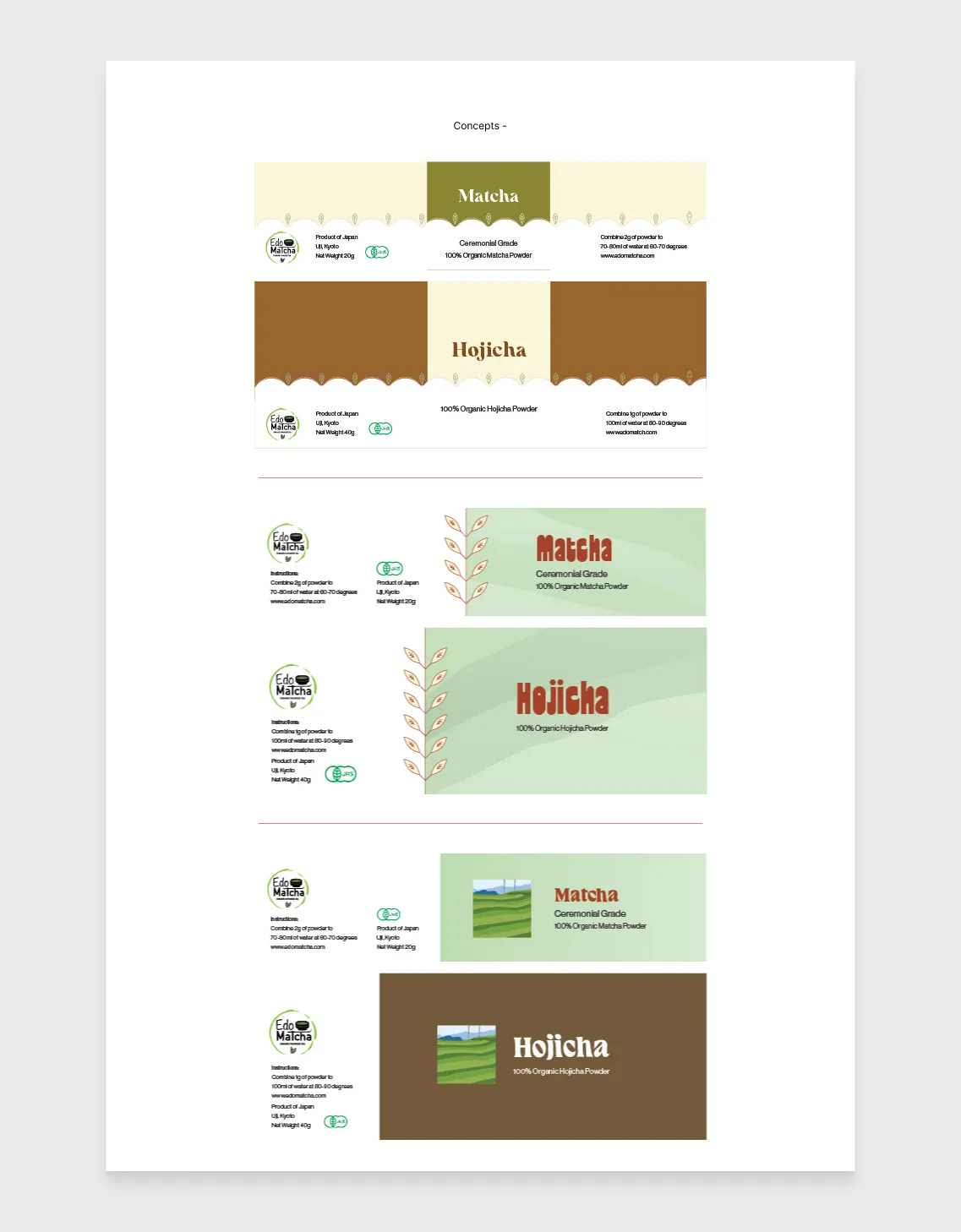
They asked me if I could help them get the designs ready, and already having a lot of experience in print, I enthusiastically offered to help.
The brief was pretty simple: they already had a logo, and they knew the instructions and the food, health, and safety information that needed to live on the label. The challenge was fitting all this into the sometimes very limited space, while still having it look well designed and fully legible.
I presented them with multiple options before proceeding, and they opted for a simple type layout with illustrative elements to represent the teas. We ended up landing on the elegant tea-leaf branch sweeping across the label, creating established sections for all of the appropriate information. What resulted was a distinctly Japanese-feeling brand that could be instantly associated with a high-end tea.
This label design has worked really well for them, and the simplicity of it means we have been easily able to expand on it as they have introduced a couple more options for their Matcha range.