Feed was approached to refresh the look and feel of eBay's C2C, or consumer to consumer, brand. With the large increase of mobile ap based competitors, the weird and wonderful resale side of eBay was struggling to keep up.
This refresh came in the form of improved functionality from eBay, but they wanted it bundled with a competitive look and feel that would excite people to jump back on the platform.
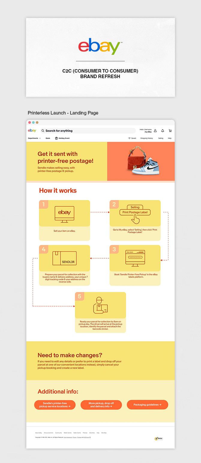
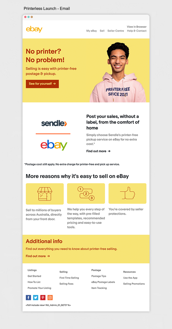
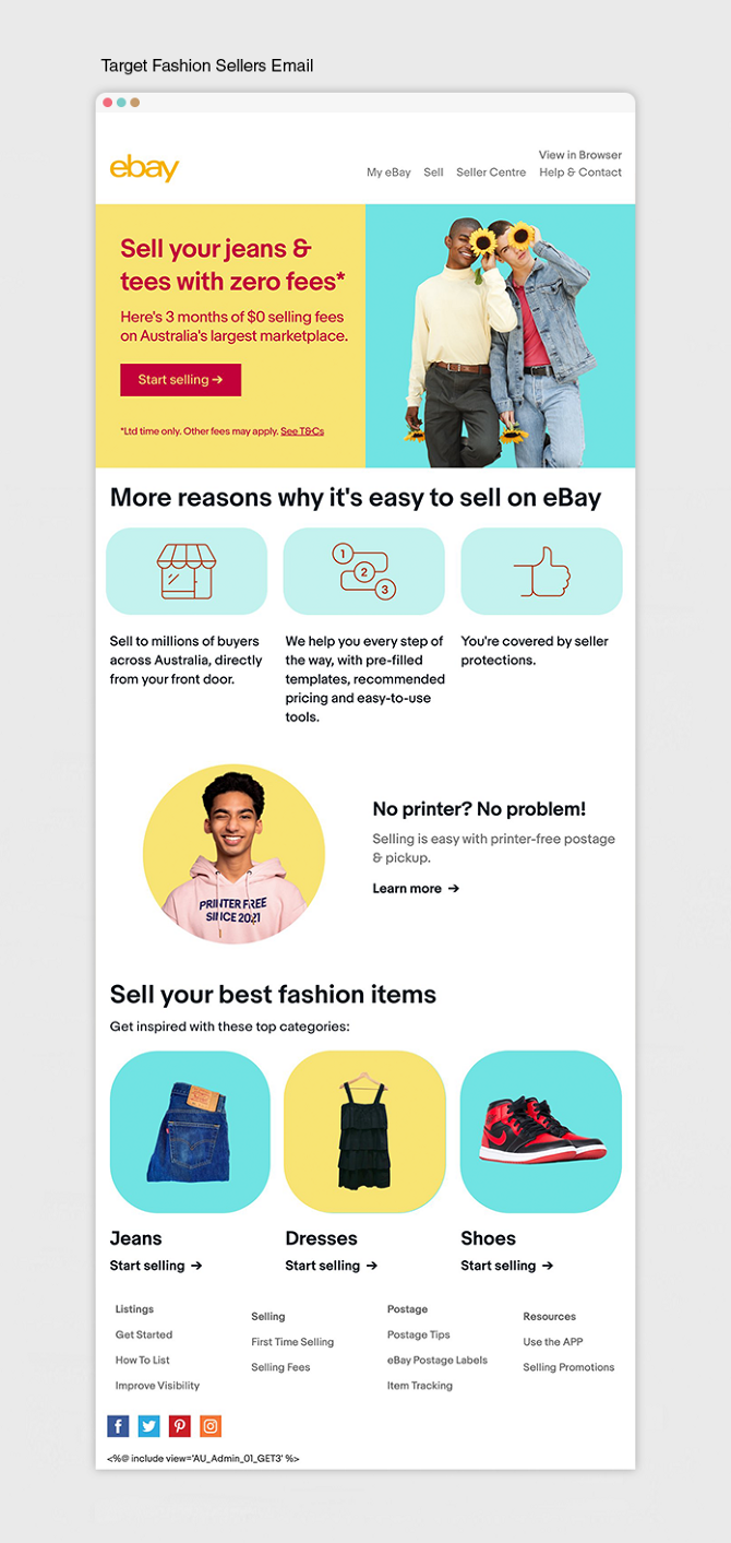
For this project I took a look at some of the newer platforms and looked at how we could improve on eBay's outdated and struggling C2C brand. I moved away from the flat colours and corporate images they were using and focused on bright engaging colours, animated personalities and products that people might have lying around ready to resell.
The challenge here was taking this improved look and having it remain effective with the large amounts of information that eBay needs to communicate to sellers. This was achieved through simple icons and effective use of white space in between the bright contrasting colours. The aim was to create a balanced flow through the landing pages that was easy to follow and didn't show you too much at one time.


