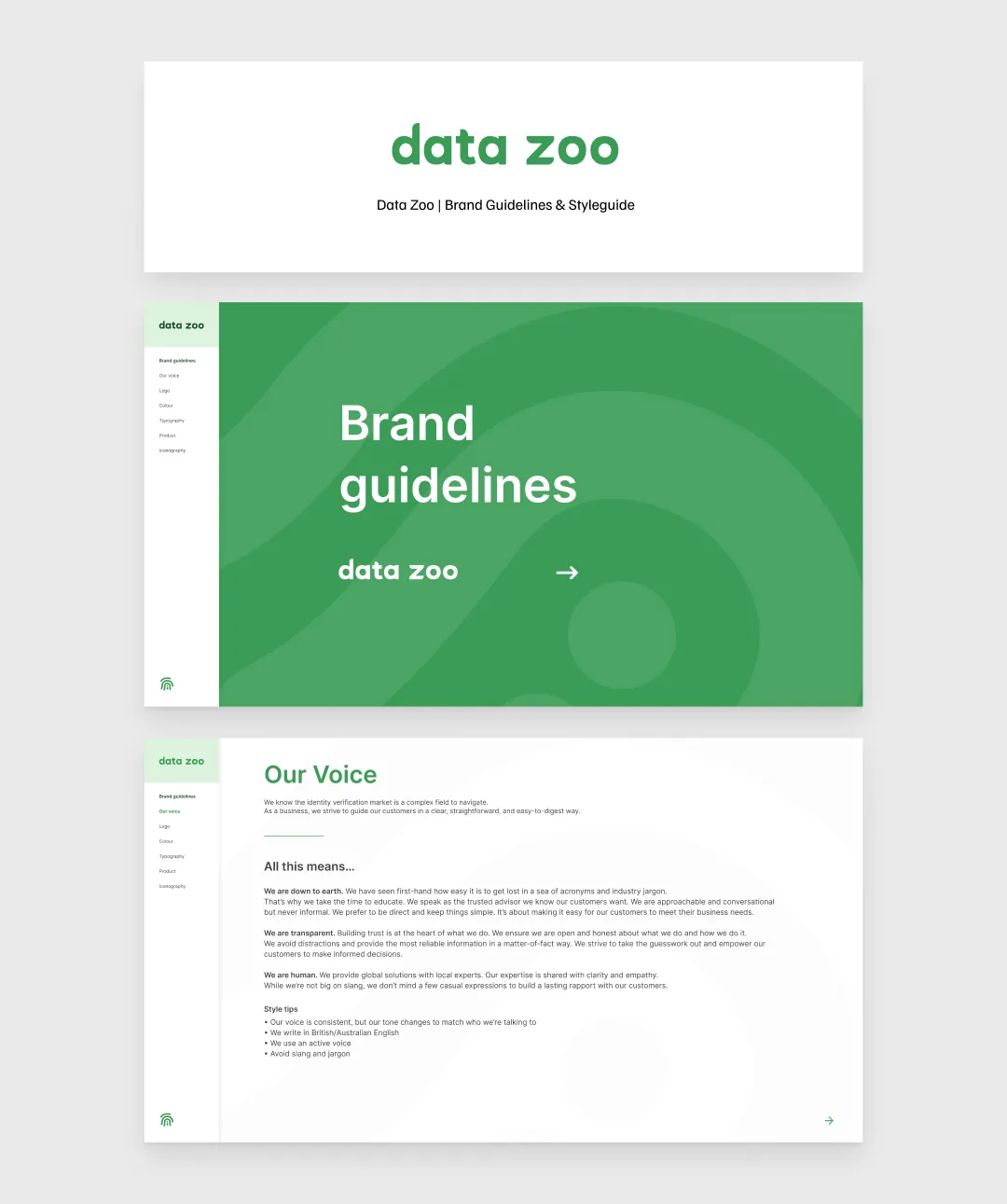
One of the most exciting parts of my role at Data Zoo was the chance to build their brand from the ground up, and carry that identity through into their website and a reusable design system.
When I started, they had a logo, typeface, a few brand elements, and a large colour palette. My task was to refine these into a scalable brand that stayed true to its roots.
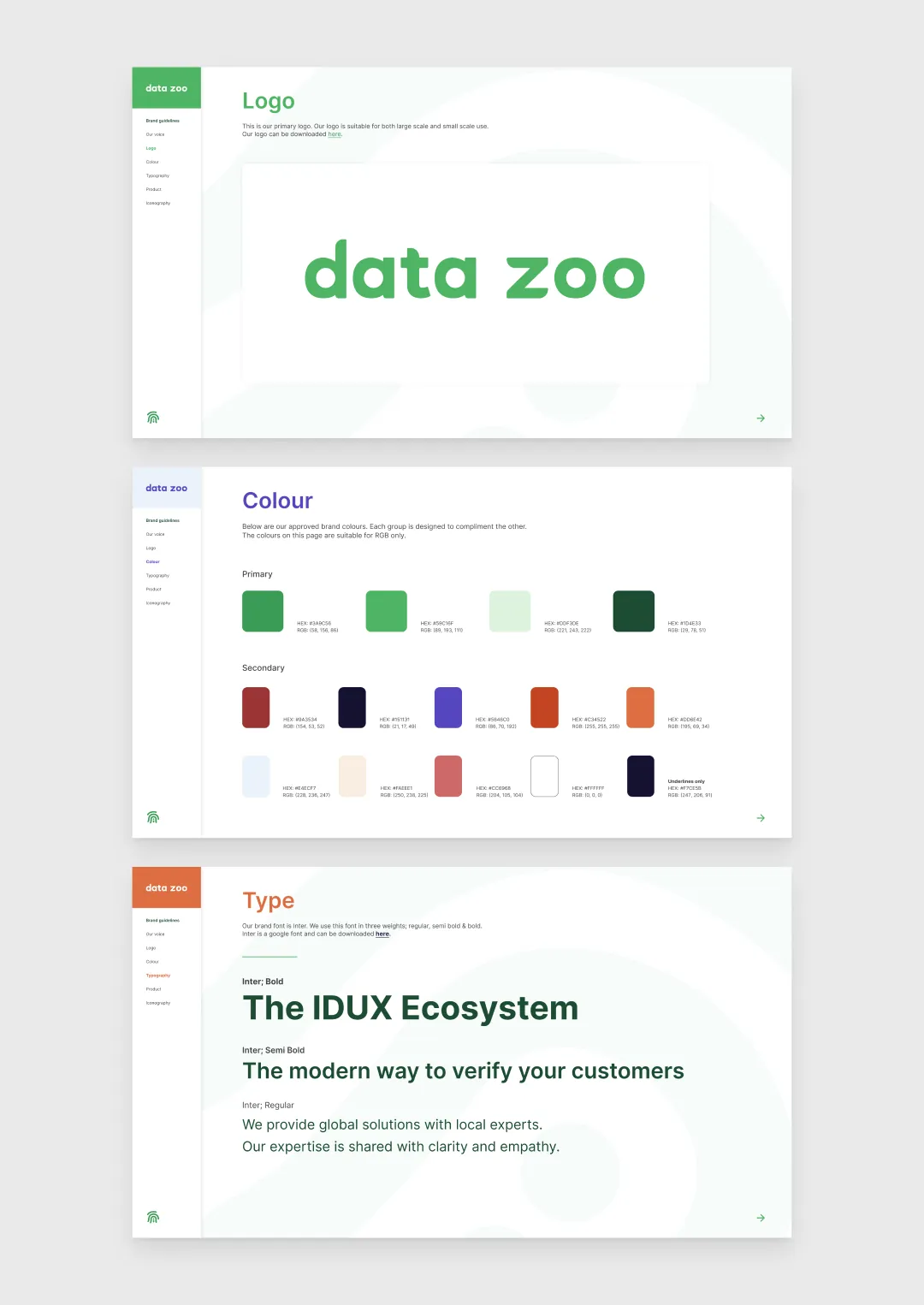
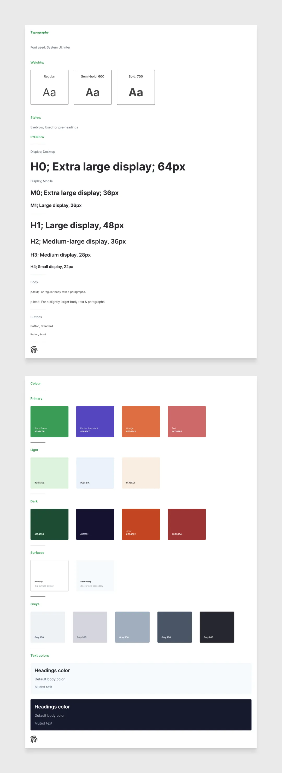
I streamlined the colour palette down to three core colours with shades for versatility. This later expanded to four colour groups, including purple.
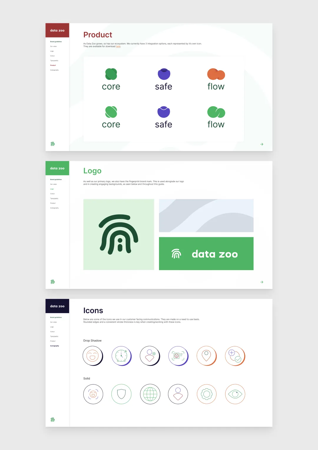
The logo type wasn’t scaling well, so I designed the fingerprint icon, which played a central role in the brand and worked well at any size, from large backgrounds to smaller elements in documents and websites.
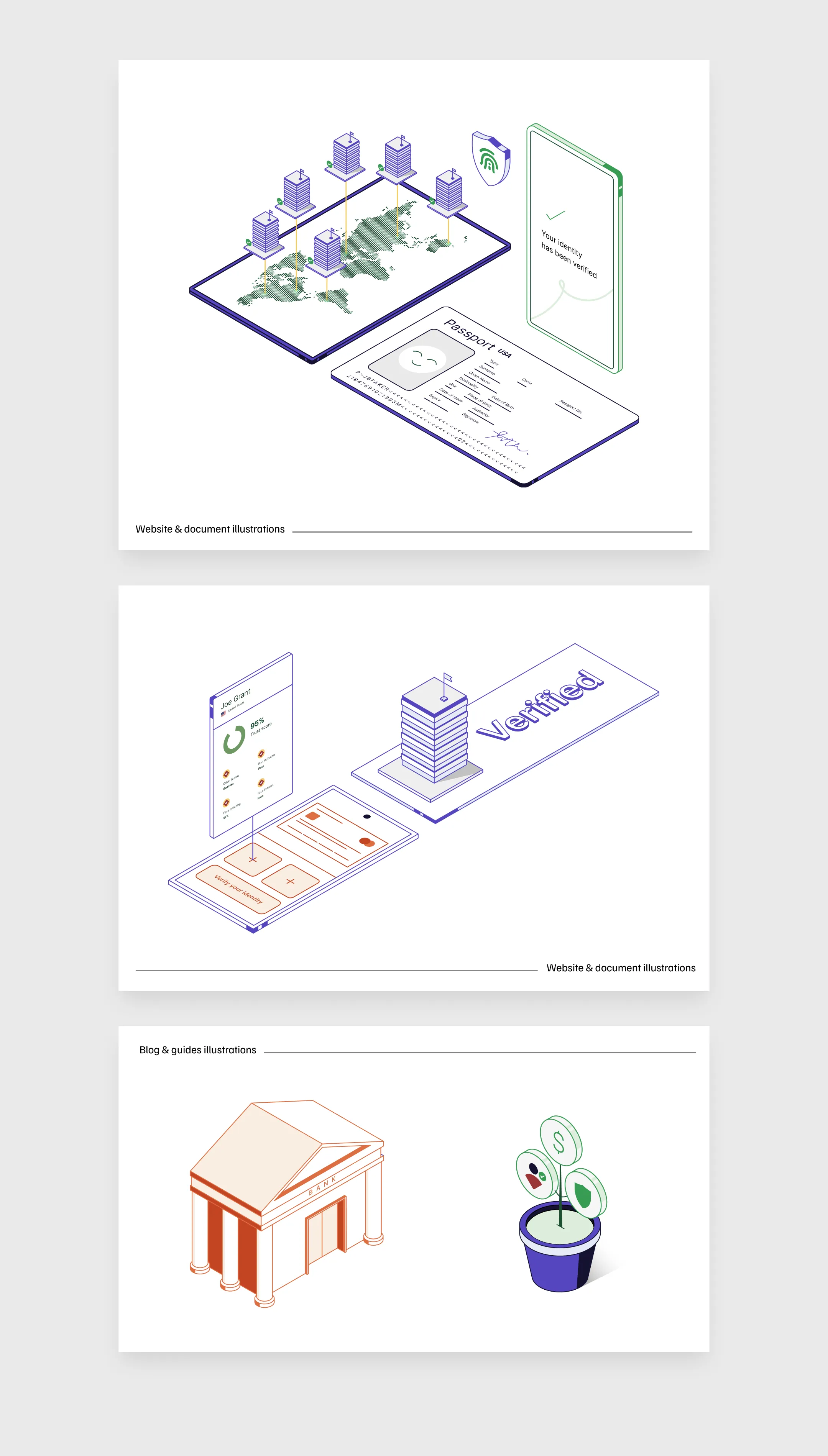
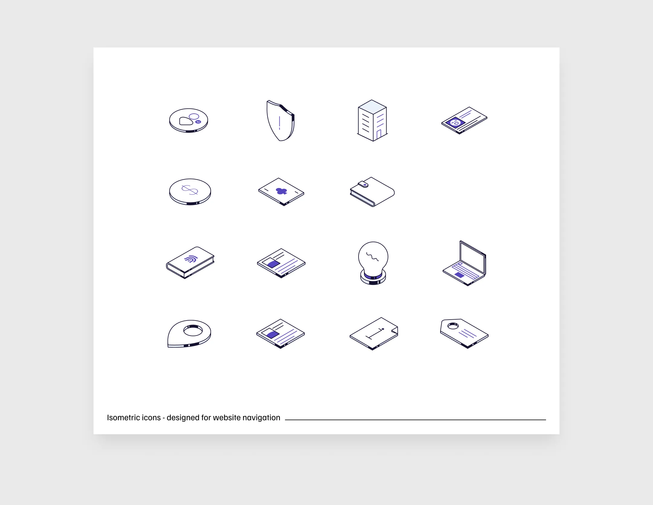
I also built a custom icon suite, ensuring consistency in stroke thickness, scale, and colour, along with a library of isometric illustrations to further enhance the brand's visual identity.
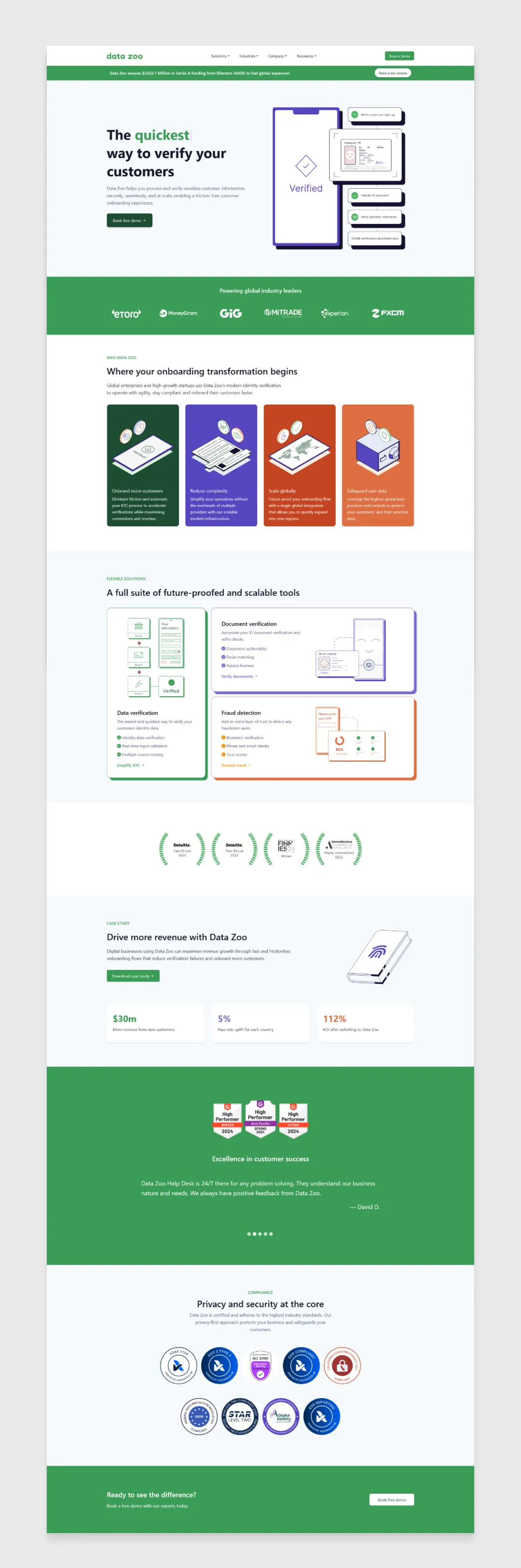
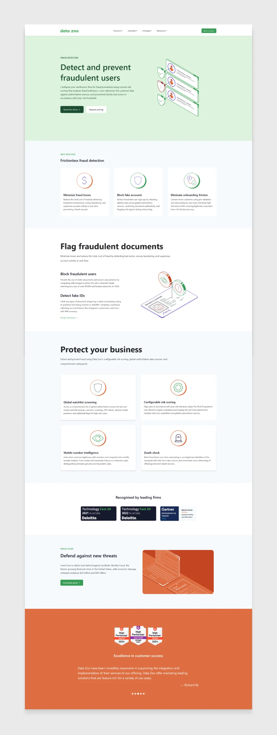
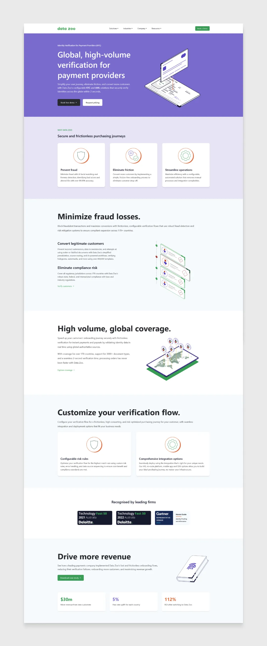
From there, an ongoing part of my role was redesigning the Data Zoo website from the ground up, to better highlight its capabilities and make the user journey more coherent.
This process started with myself, the developer, and a key member of the product team getting together and breaking down any current page or issue we were working on, identifying what to keep, drop, or rework.
I would then make a rough wireframe for the content team to add copy and image requests to, before turning it into developer-ready Figma files covering multiple breakpoints for desktop, tablet, and mobile.
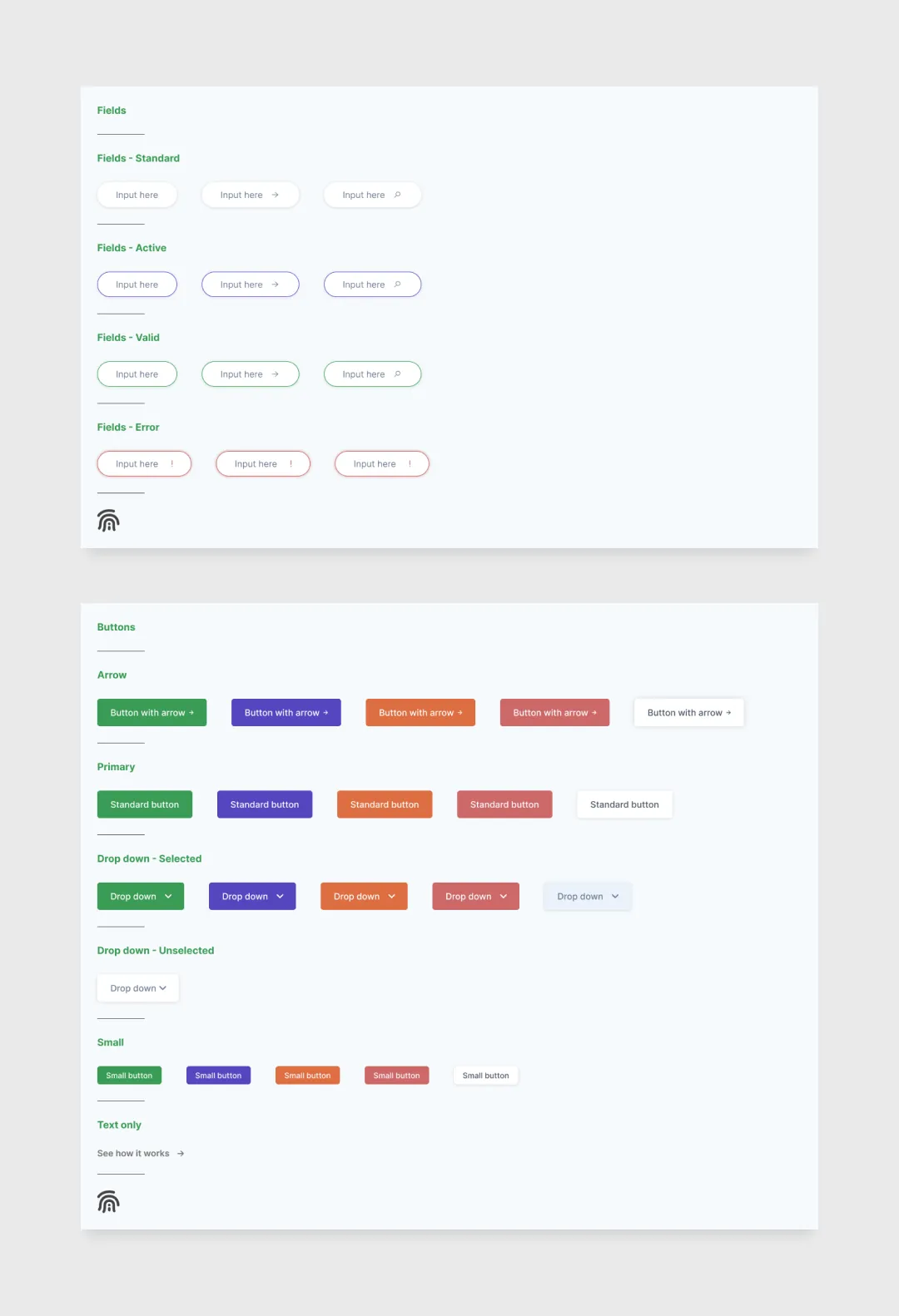
To keep this process efficient and consistent, I developed a UI design system housing all the assets, fonts, and sizes used across our webpages, built by meeting with the team members who'd use it and noting what would make their work easier.
This design system, paired with the brand guidelines, became a priceless tool in growing the Data Zoo brand.